
A repo can look like a roadmap if you summarize it badly. Point a smart agent at a codebase, ask “what does this product do,” and you get a clean, confident list of features. It reads like progress. It rarely tells you whether any of it should still be there.
Claude Code is excellent at reading a repo. It finds subsystems, traces events and routes, spots instrumentation gaps, and answers with judgment. For ad-hoc diagnosis, reach for it. This is not an article about Claude Code being weak.
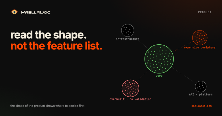
It is about a harder one. Forget what is in the repo. What shape does the product you built actually have? That question needs something Claude Code throws away between chats: a memory of the product as a system.
That memory is Compass, the new product-reasoning view inside PaellaDoc. It reads your repo and your artifacts into a graph, keeps it on your machine, and talks product, not code. The rest of this is what that gets you.
What is a product knowledge graph?
A product knowledge graph is your built product seen as a system instead of a list. It carries the zones and how they connect, where each piece came from, how far it sits from the core, and whether anything has actually proven it. The obvious version of it, a tidy PRD-to-epic-to-story-to-criteria tree, helps. That is not where the value is.
The value is reading the shape. Where is the real center of what got built, and what sits far out and costs a lot to keep? Some zones are bridges between two worlds, some are plumbing, some are growth bets nobody has tested. The graph shows you which is which.
That is topology, and it turns a product into a map you can decide from. A feature list tells you what exists. The shape tells you where to look first.
What can a product’s shape tell you, and what can’t it?
A topological read of a product graph can infer:
- the real center of the built product
- the expensive peripheries
- the bridge capabilities that connect zones
- the duplicated or fragmented areas
- the line between infrastructure and user value
- where effort is concentrated
- the distance between a zone and the core
- the validation debt: heavily built, barely proven
- the questions that should unblock a decision
It cannot infer, from shape alone:
- whether users love a feature
- whether a zone makes revenue
- whether a bet was good or bad
- whether the original roadmap was right
- whether a far zone should be deleted
The shape does not decide for you. It tells you where to decide first. That gap, between pointing and deciding, is the line Compass has to hold against itself.
What does product topology look like in practice?
Take a language-learning app, the kind anyone could picture. Read its graph as a map and a shape appears fast:
- Core: the learning engine. Lessons, spaced repetition, progress, levels, review.
- Load-bearing infrastructure: the content pipeline, audio, the daily job, auth.
- Bridges: onboarding into the first lesson, the streak loop that pulls people back, a practice mode that reuses the lesson engine.
- Expensive periphery: leagues, leaderboards, clubs, a social feed, seasonal events, the competitive backoffice behind them.
- Speculative bet: a public API and a schools-and-teams platform.
- The central risk: a large competitive machine has been built on top of a learning engine, with no proof that it converts into learners who actually keep progressing.
Now the product question is not “are the leagues good or bad.” It is sharper:
Are the leagues an acquisition channel that produces retained, progressing learners, or a second product that eats the focus of the first?
You cannot answer that from a feature list. You can start to answer it from the shape, plus the one missing measurement it points you to.
Compass vs Claude Code: which one for product decisions?
Use Claude Code to diagnose the repo and Compass to read the product. This is not a contest of who is smarter on one question. It is two different jobs.
| Claude Code, direct | Compass |
|---|---|
| fast, sharp repo diagnosis | turns the repo into a product map |
| finds concrete evidence: services, events, routes, commits | finds shape: core, periphery, bridges, density |
| highly actionable operational gaps | separates infrastructure from user value from growth bets |
| cheaper and more direct | repeatable product questions without starting from zero |
| re-analyzes from scratch each question | keeps structural memory between questions |
| reads the repo | reads the product as a system, with provenance |
I ran both against the same product. On “what is heavily built but barely validated,” Claude Code was strong at finding concrete instrumentation gaps. Compass was better at structuring the debt: how much of the graph is inferred versus backed by an independent source, which zones are overbuilt relative to their distance from the core, where construction has outrun proof.
On “map the topology: real center, expensive peripheries, bridges, infrastructure versus value, overbuilt-without-outcome, urgent validation questions,” the two read differently. Claude Code wrote like a technical auditor: broker links, events, services, languages. Compass wrote like a product memo: core, periphery, bridges, the risky assumption, the decision.
Scored as a CPO would score them, the product memo won, but not by a landslide. And here is the part worth saying in plain words: to reach a top-CPO memo, the map is not enough. It needs real business: revenue, CAC, LTV, cohorts, commercial commitments, company strategy. Compass maps the built product. It does not invent the numbers it cannot see.
How should a product knowledge graph explain itself?
A graph is not a tool. A graph translated into a decision is. The difference is in the language.
Not this:
EPIC-09.1 has 45 reverse-intake artifacts, distance score 15, validation gap 100.
This:
You have built a large competitive machine on top of a portfolio of lessons. It might be an acquisition channel, but there is no proof yet that it converts into learners who keep coming back.
Not this:
The graph shows semantic bridges between zones.
This:
Onboarding and the streak are the bridges between getting people in and real use. If those bridges do not measure active progress, you cannot tell whether the periphery is working.
None of this is about a prettier answer. It is turning the structure of the product into one sentence a product owner can act on.
Can you trust a reverse-engineered product knowledge graph?
If the graph comes from reverse intake, Compass has to say so, out loud, every time. A graph read from the built product can say “this is what the product you shipped suggests.” It cannot say this was the team’s strategy, that users validated it, or that the market wants it.
Owning that boundary is not a weakness. It is most of what separates a product map from a confident hallucination. A graph that paints a clean story over messy code is worse than no graph, because it reads as truth. So you mark what is built, what is guessed, and what is actually proven, and you keep the three apart.
Why does product topology matter more with AI agents?
Before, a product manager could paper over missing product memory with meetings, docs, a roadmap and personal judgment. That worked because building was slow enough to think between releases.
With agents, the cost of building drops far enough that the risk changes. The question stops being “can we build it?” It becomes:
- why are we still building this?
- which part of the product is growing with no evidence behind it?
- which bet quietly turned into inertia?
- what did we mistake for progress because there was a lot of code?
The build trap was always real. Agents accelerate it, because more code arrives faster and looks like momentum. A product map made of zones, provenance, distance and validation debt is how you put a brake on it: not by building less for its own sake, but by deciding with the shape in front of you.
So
Claude Code tells you what is in the repo. Compass tells you what shape the product you built has. And the shape is what lets you decide what to protect, what to freeze, what to validate this week, and what not to build yet.
The advantage was never a nicer answer than an agent reading code. It is that the built product becomes a memory you can walk: every zone carries where it came from, how far it is from the core, and whether anything proved it works. That is the layer where product decisions stop starting from zero.
This is the upstream half of keeping the product contract alive, and the same bet as product management in the AI era: when building gets cheap, the edge is deciding with memory, not vibes.
Compass ships inside PaellaDoc, local-first and free. It builds this graph from your own repo, no cloud and no account, and turns it into product decisions you can act on.
What part of your product is growing with the most code and the least proof? Tell me on the forum.